PREPPING A MEDITERRANEAN FAST CASUAL FOR EXPANSION
THE CHALLENGE
Taïm is a Mediterranean fast casual restaurant chain. When we got to it, it had ambitious expansion plans, but the brand itself lacked visual distinction. Every store looked different, it was using three different logos, and it had no structured or consistent visual approach.
We had to get to one singular brand identity that Taim could leverage across every customer touchpoint.
THE IDEA
Our research isolated three things that the brand could own: authenticity of recipes, bold flavors, as well as the expected health factor that’s associated with eating Mediterranean food.
EXECUTION
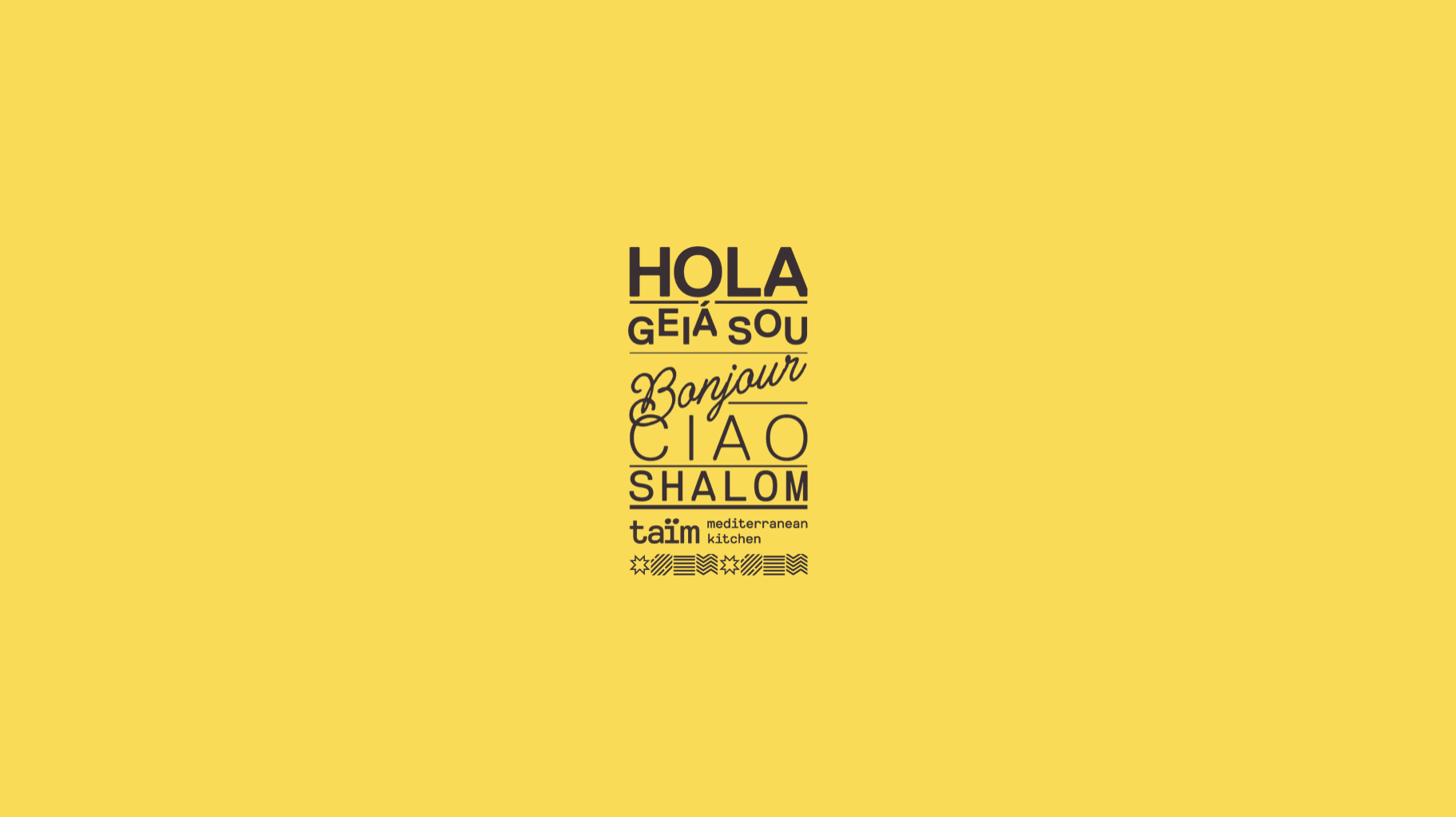
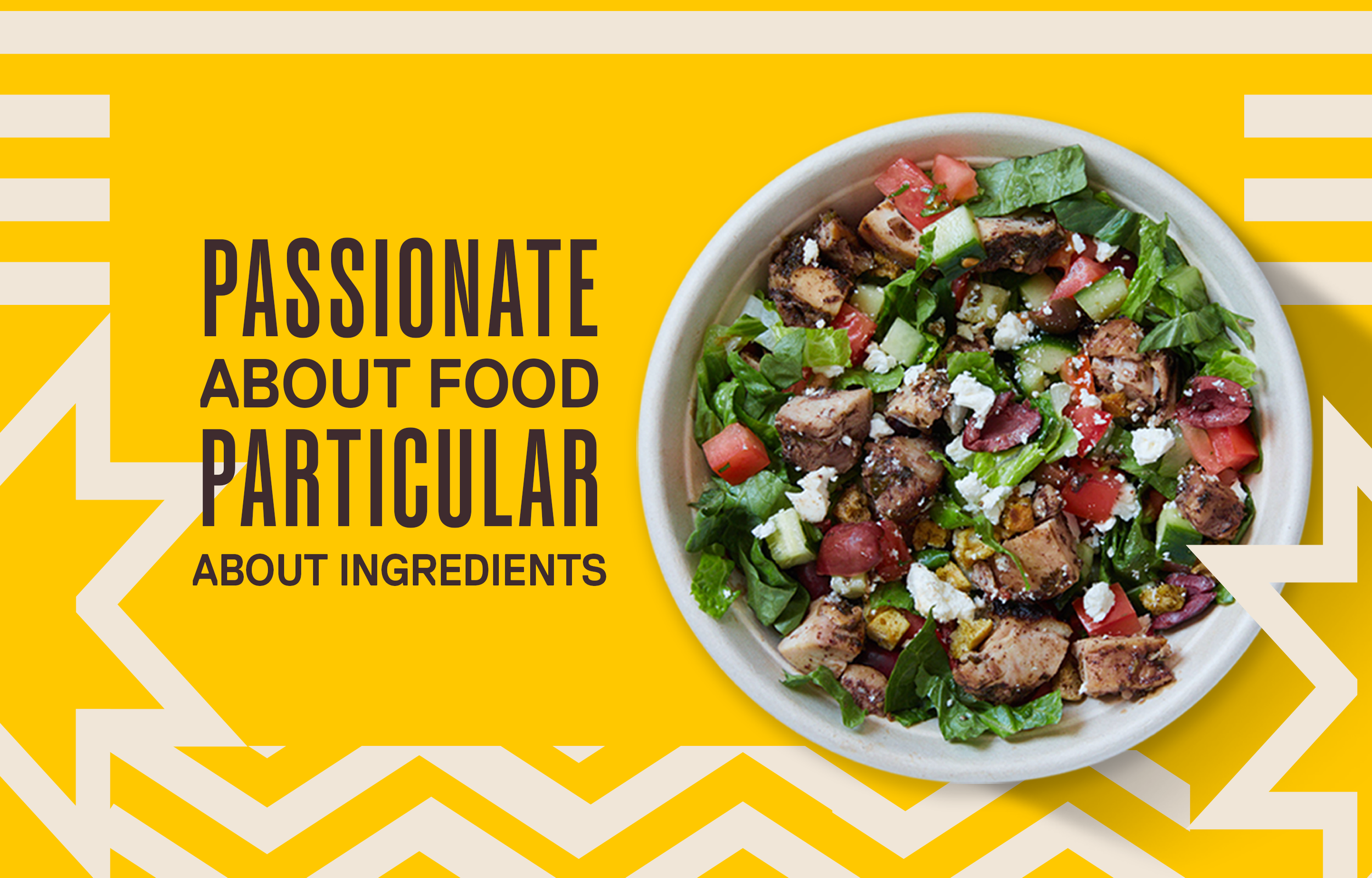
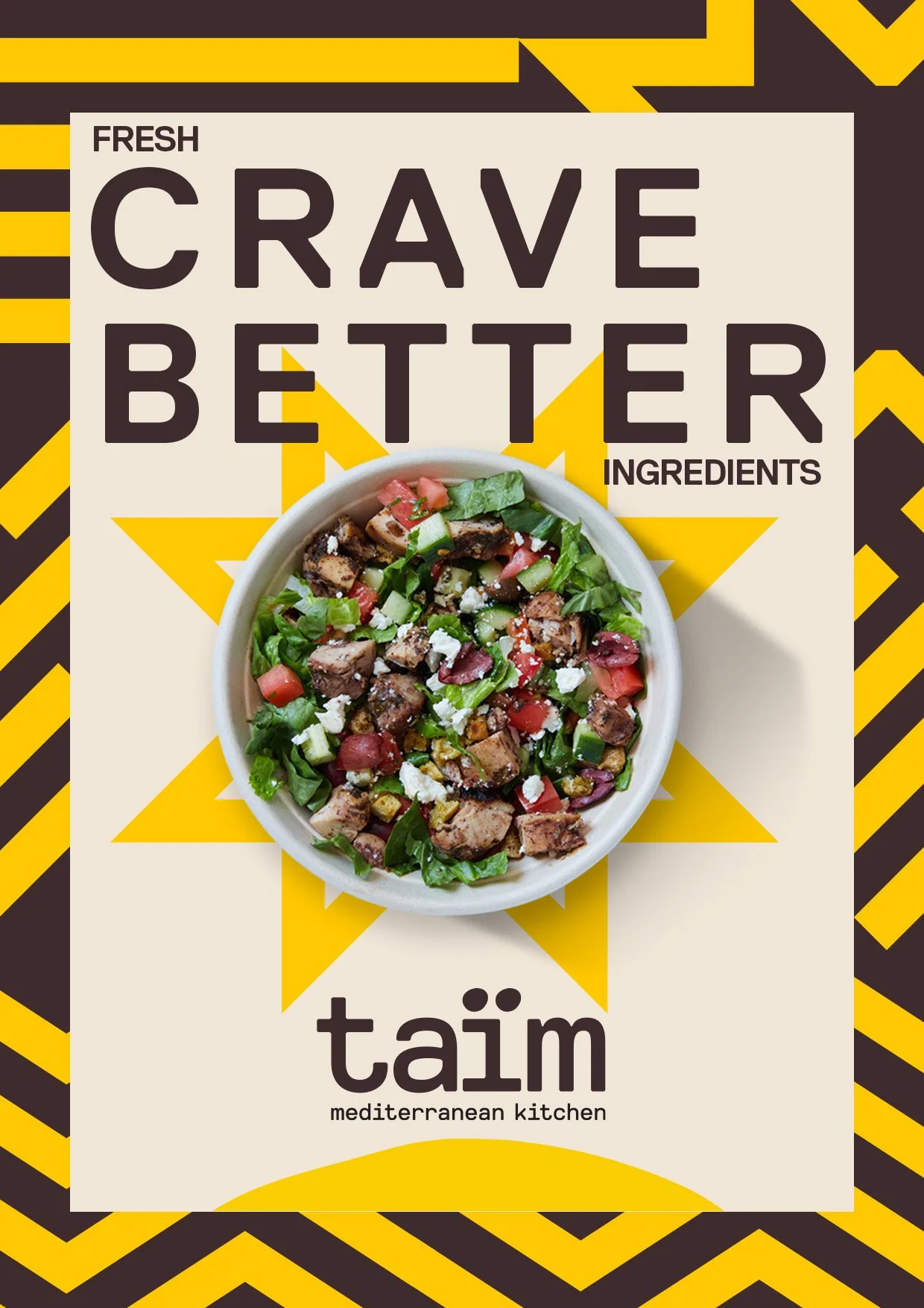
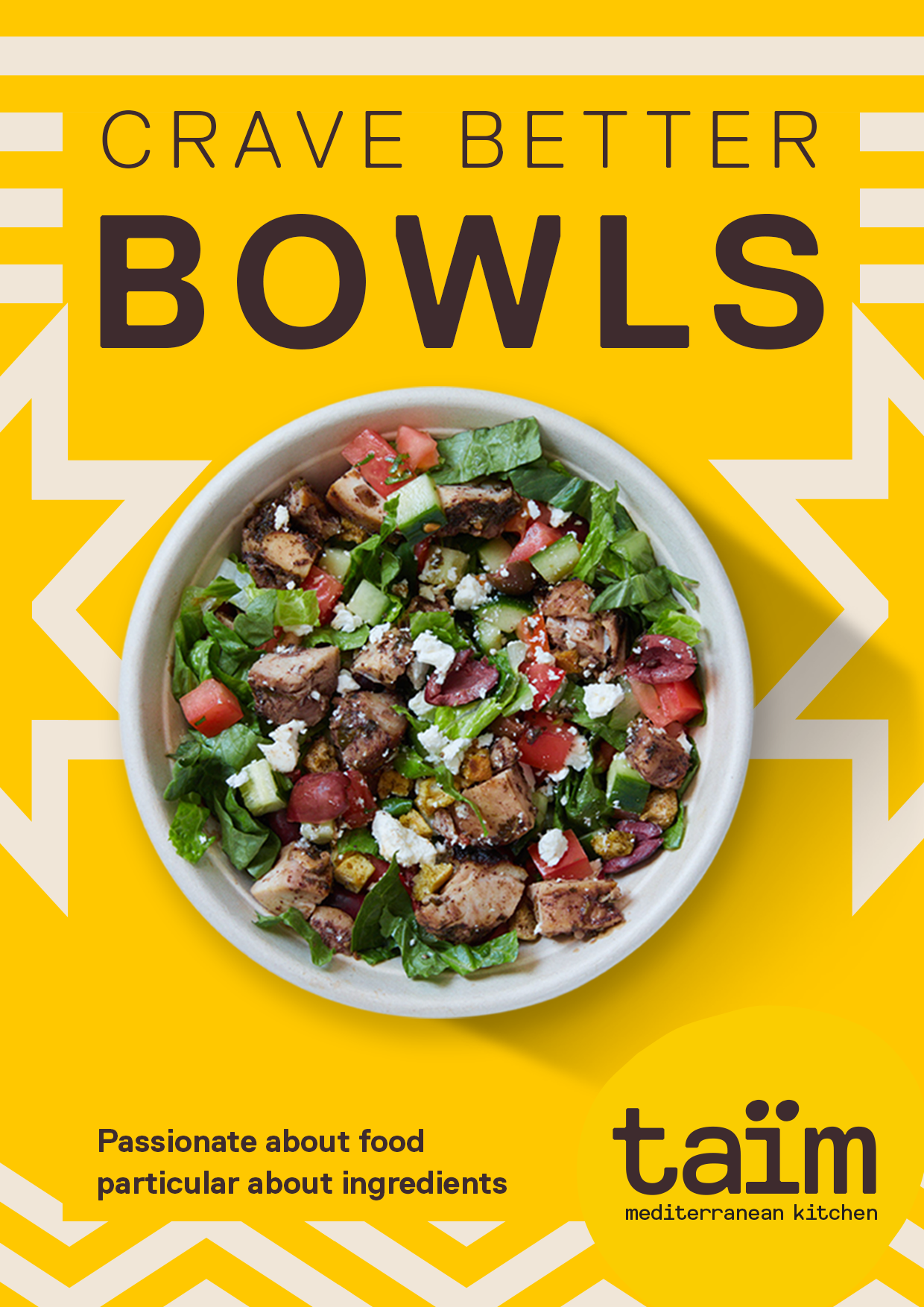
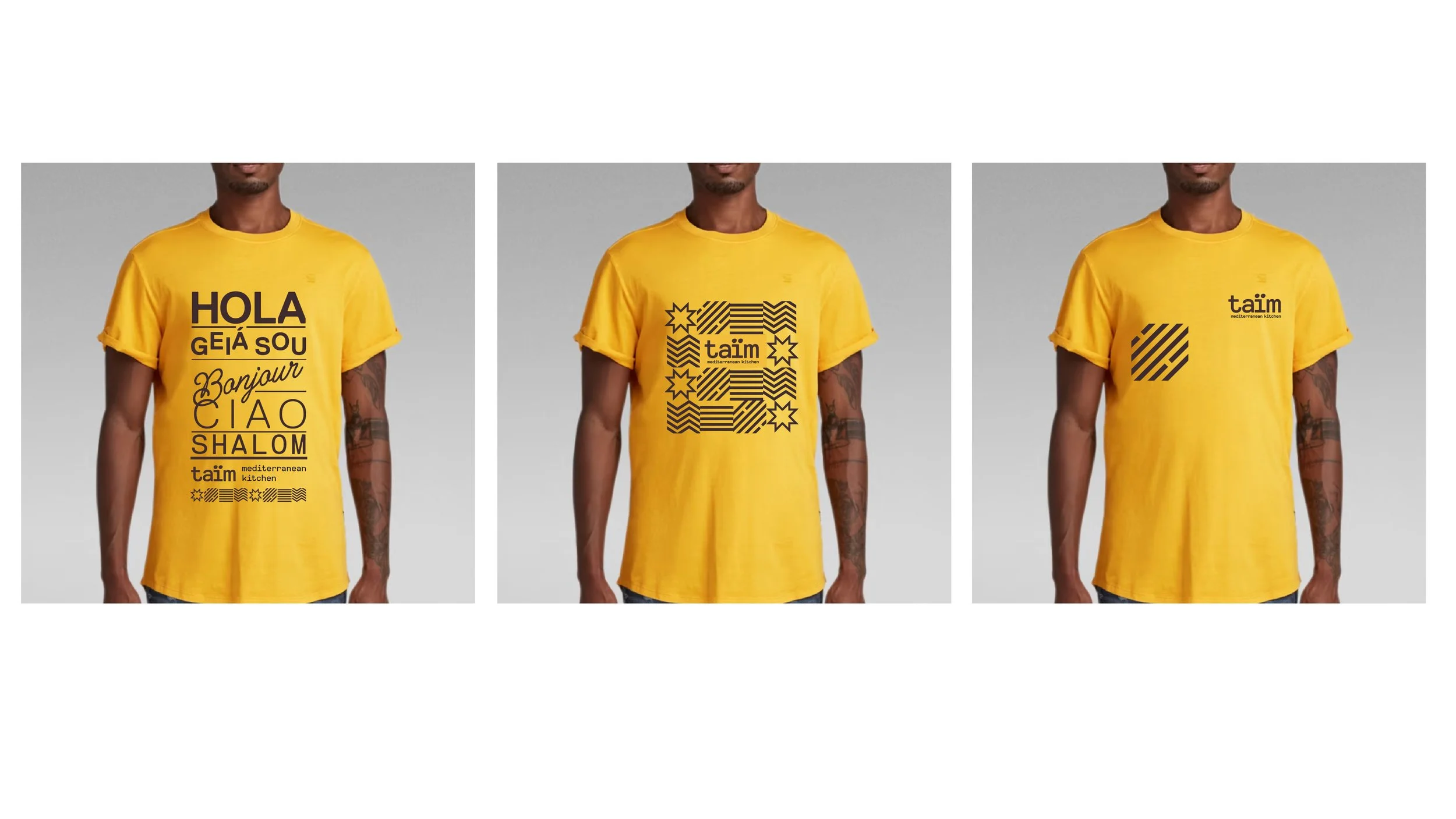
We planted our differentiation flag in being the more authentic option. Creating graphics to depict the sun, sea, rain and land elements that are so integral to the vibrancy of Mediterranean cuisine.
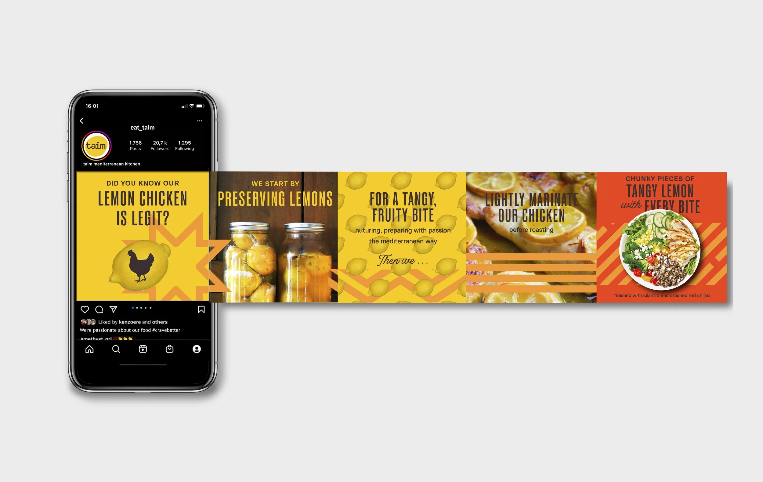
We then used these distinctive assets, along with a bold new color palette and typographic approach to grab attention at every conceivable customer touchpoint.
